Happy new week to you all! The weeks are simply flying by; two and a half months til Christmas?! What? I’ve started making my Christmas ensembles, and thought it was too early. Not really, is it?
Making things for Christmas means using lots of red. My biggest gripe about red is that I will need to photograph it, and it’s hard to make red look nice. Red looks nice against the Christmas tree, but that isn’t up yet. The tree farm isn’t even open yet, and even if it were it is a little early! But, anyway, this got me thinking, how can I simulate a Christmas tree background so that my photographs with red things look nice.
Here’s my basic backdrop setup. I’ve been taking photos in my daughter’s room for the past couple of months. There are two sets of windows facing south and east, so it is bright in the morning. Before that, I was taking photos in our family room which is darker. It didn’t seem to matter much which room I used. (I use a tripod, so the shutter speed can be slow to adapt to changing light conditions, and I use the timer on my camera which eliminates any movement from my hand.) The photos were dark even though the room was not.

I got this backdrop support last Christmas. I’ve been using it with a white sheet and have noticed that usually my doll ends up too dark for my liking. My husband told me that the camera tries to average everything in the frame to an 18% grey. Since the huge amount of white is so light, the camera wants to darken it, and so the doll gets darker too. So, if the outfit is dark, it’s not good at all. If the outfit is light, it isn’t too bad, but still a little dark. Afterwards, I always have to lighten up my photos.
I decided to darken the background. After pinning bright green napkins together and then using a piece of army green knit, both of which didn’t do much for me, I decided to order some one-yard pieces of green fabric to try and mimic a Christmas tree.


I ordered various shades and values of green. I have tried four of them for this ensemble, photos below.

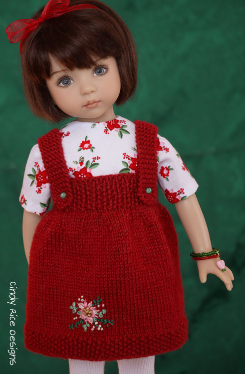
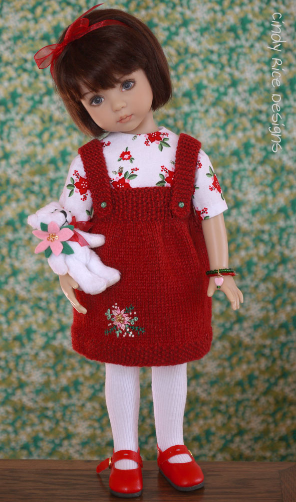
You can see how the background changes how Gina and her red jumper look. I like some fabric better than others, but they are ALL a major improvement. I also think that different dolls/outfits will look better with different fabrics. I’ll need to experiment for each one.

Fabric #1

Fabric #2

Fabric #3
Fabric #5
The lens I use is a 14-42 lens. I know there are other lenses to get the job done better, but this is what I have for now. This lens allows me to zoom in on the doll to get a narrower shot, otherwise I would need a much larger piece of fabric. My f-stop is open as much as the lens allows (5.6) so that the background will blur. If my lens opened up more (a smaller numbered f-stop) there would be even more blur happening. The doll is usually about 4-5 feet away from the fabric, but this can change.

The photo above is fabric #1, but the doll is closer than in the one above, so the background is less blurry.
I am constantly learning new things about photographing my dolls. I am no expert… at all!!! I just wanted to share with you what I’ve figured out about photographing reds. For me, it’s mind blowing; all these years I’ve struggled. Now, I am happily pulling out all of my red yarn and fabric. Woo hoo!
If you have any questions, please ask away. If I don’t know the answer, I’ll ask the resident photography expert (to me, anyway), my husband. He knows so much more than I do.
Wishing you all a great Monday and a great week ahead! Bye for now!
❤